By Pat Grant
Ahead of Yours & Owls festival, local creative Pat Grant gives us a detailed look at the artwork behind the festival. Read below and grab your tickets to see At The Drive-In, The Presets, Dune Rats and more at Yours & Owls right here.
The first part of the festival ID process involved sitting around with the guys from the festival and the design team, drinking beer and talking about what worked last year and what didn’t work. The big thing is setting the mood for the festival to come.
The boys said that they were keen to respond to these weird political times by presenting more of an enlightened vibe, perhaps the festival should present possibilities for a more progressive civilisation. They wanted the theme for the festival this year to be ‘Moon Beach’ and showed us some cool psychedelic projection work and a score that they had commissioned as a secret show for the fez in 2016 under the same name.
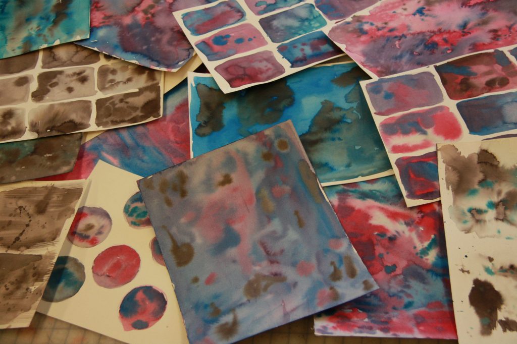
One visual idea that came out of this meeting was the idea of incorporating a trip watercolour texture into all of the festival design. So I made swatches. Lots of swatches:
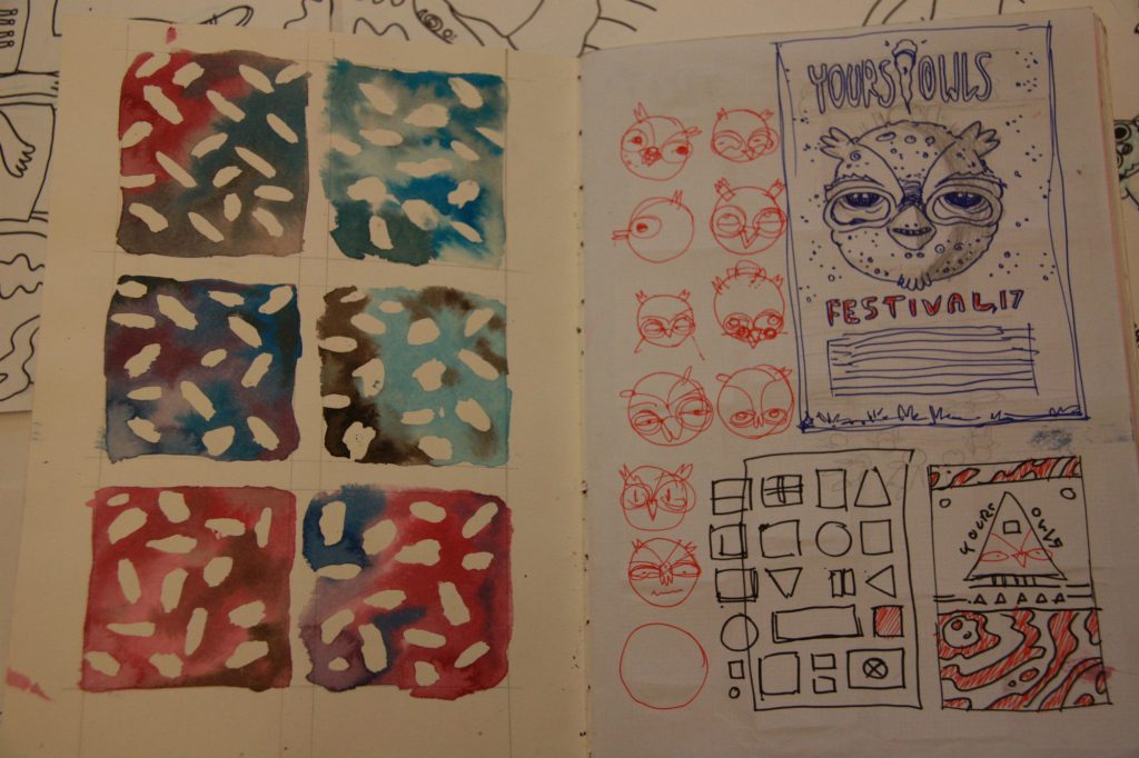
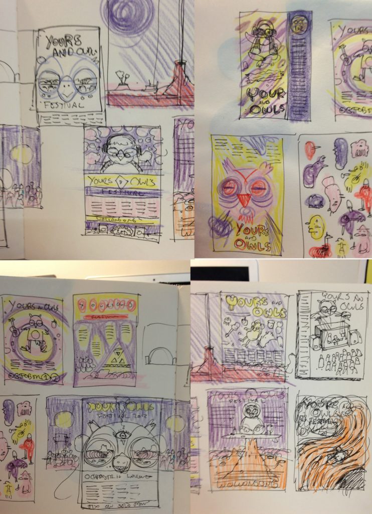
I went to work in my sketchbooks trying to get as many ideas out onto the page as possible. This is my favourite part of any job:
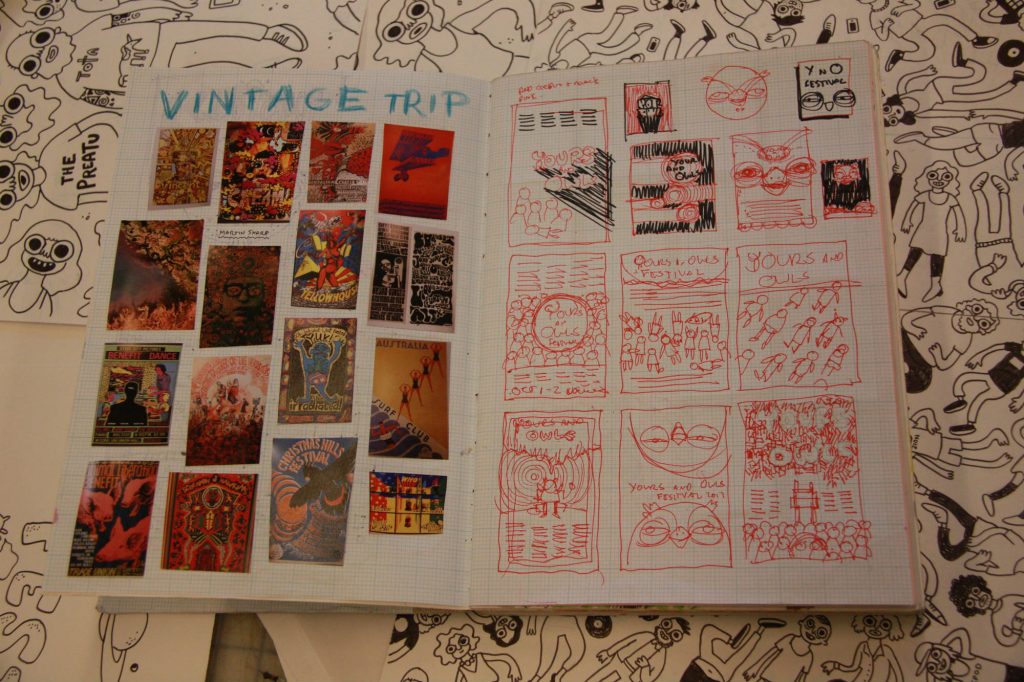
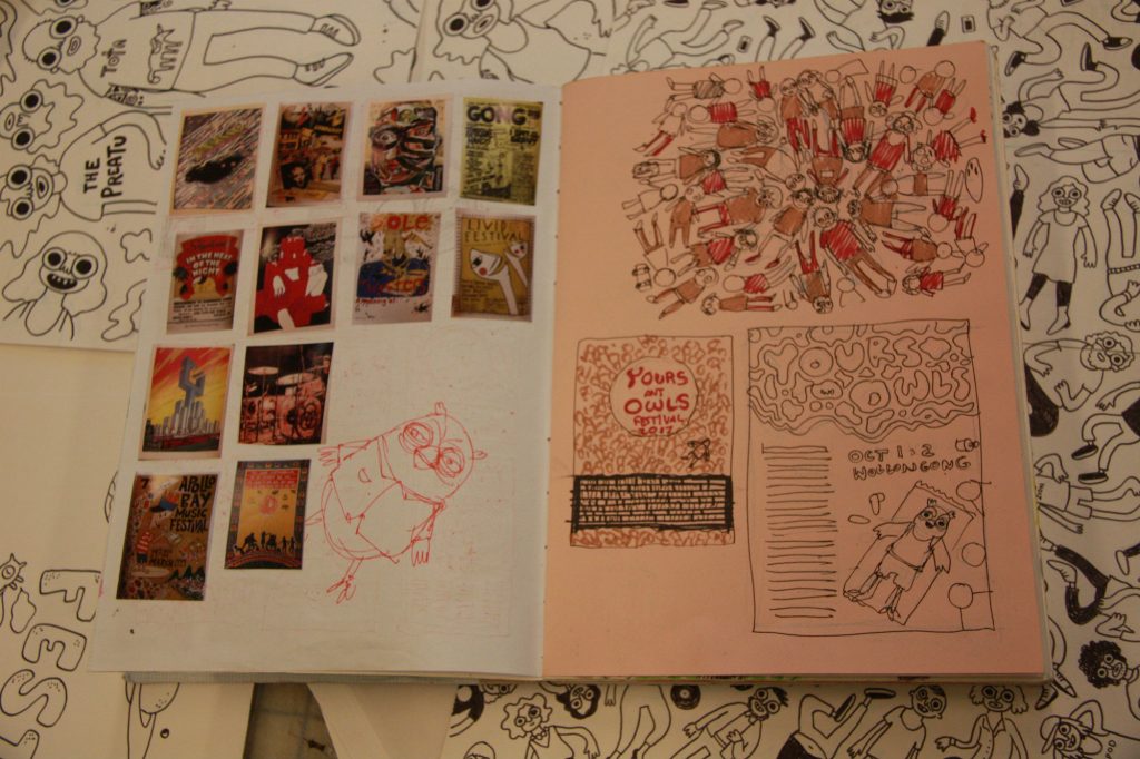
While I’m doing open-ended design thinking, I also try to do research at the same time so I went to the Wollongong Uni library and rubbed my eyeballs over a few thousand music posters. I’m really conscious of this job being part of a bigger tradition of Australian music and surf graphics. I want to pay homage to all that history and learn from it:
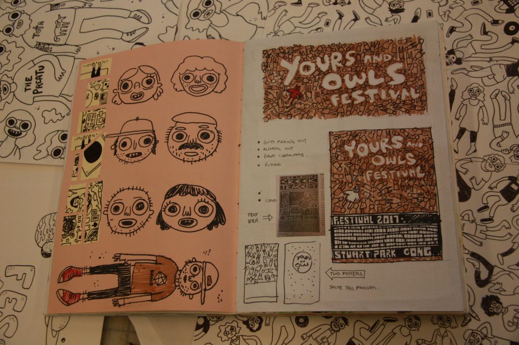
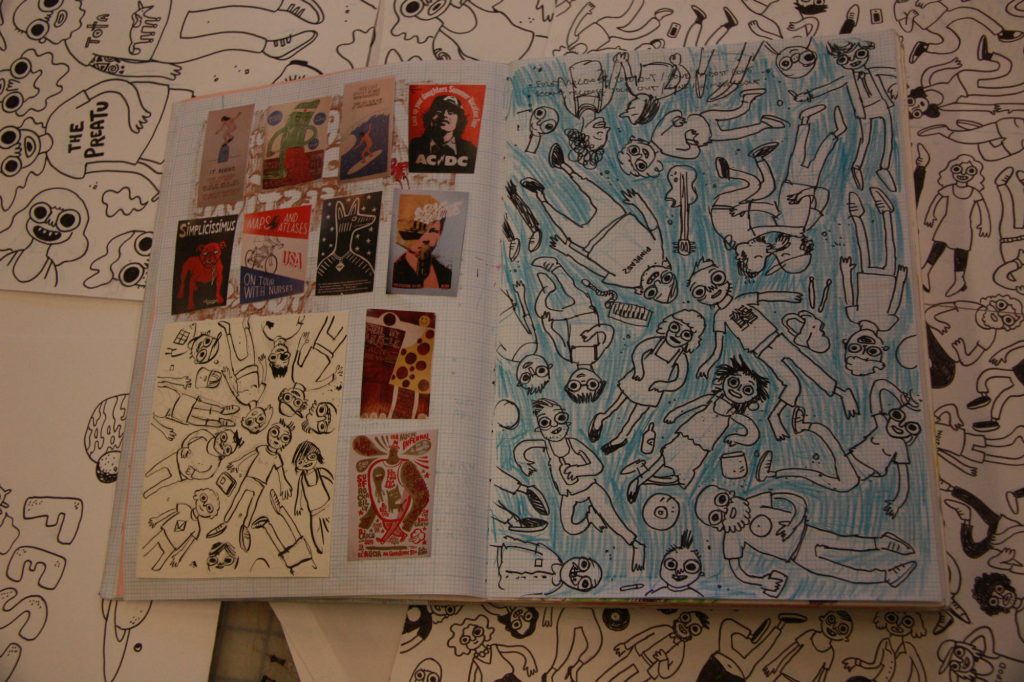
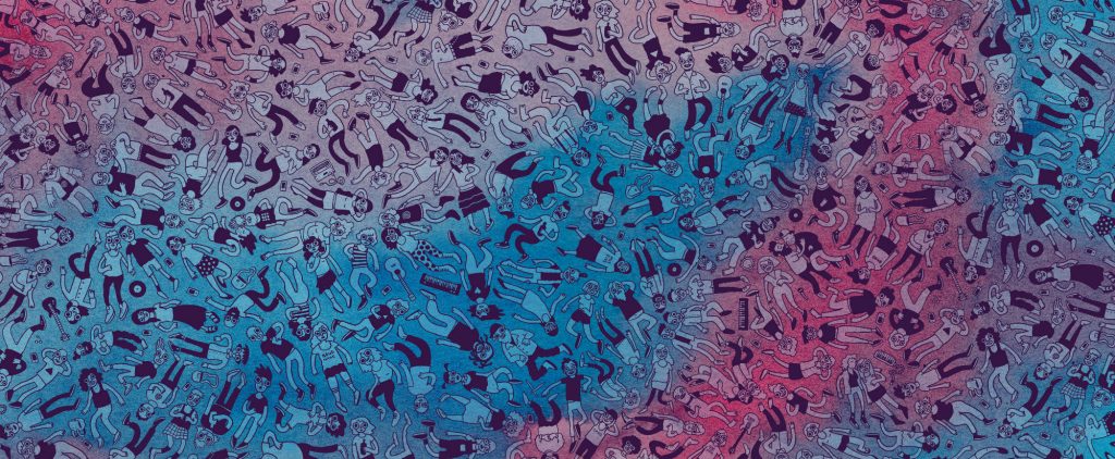
The main idea that I came up with that was going to hold the festival together was not necessarily the space idea, but this idea of live music as an opportunity for people to come together for a moment of communion. I arrived at this image of a thousand people all lying on the grass at Stuart Park. They’re not fucked-up or passed-out, nor are they on their phones or emotionally elsewhere, but they just there… you know… having a little moment together.
These are the moments I remember most from the festivals iI’ve been to since the Van’s Warped tour 98. The idea would be presented in a massive drawing of a diverse bunch of people lying on the grass, looking up at the sky:
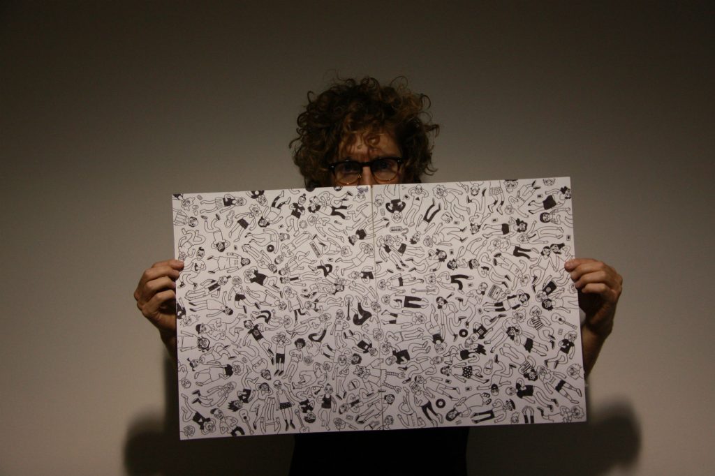
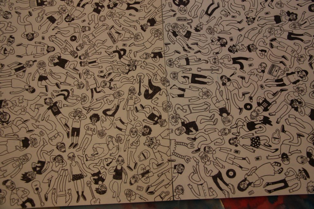
This is the drawing. It took fucking ages. I had to imagine real people a lot of the time to make each person different. Kirk Hammett from Metallica is in there somewhere. So is my sweetheart. So if this girl in this killer green jumpsuit that I saw at the festival in 2016.
While I was drawing I listened to the S-Town podcast. My shameful secret is that I’d rather listen to some nerd talking about history or politics than some cool person playing guitar. Soz. Combined with a watercolour pattern it came up like this:
The poster and web graphics came together first:
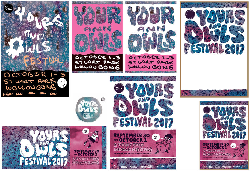
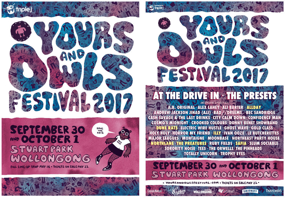
The poster is always a pain in the arse because there is SO much information that needs to go onto it. There’s never much room for interesting visual ideas. From my research I discovered that all the best music posters are for shows with only two or three bands on the set. I had a lot of trouble getting the layout to work. Kat Tillman saved the day with the type. Here’s the final:
https://www.youtube.com/watch?v=04eUOHfixEE
