Get familiar with Splendour’s artist in residence right here.
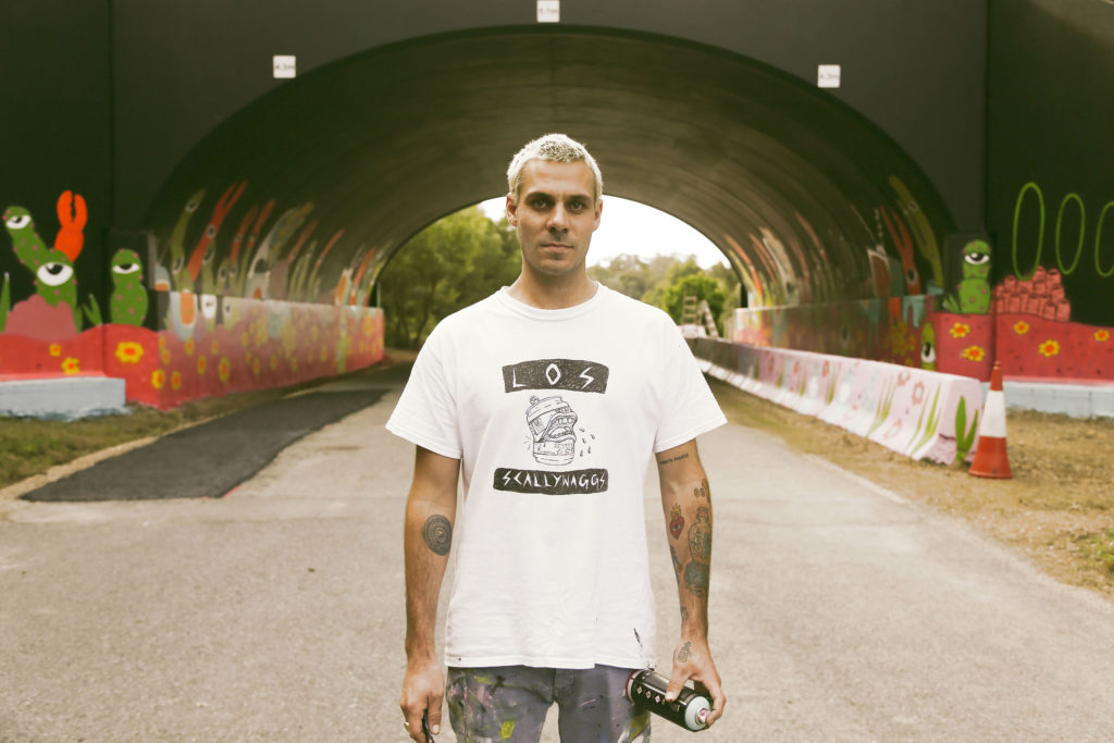
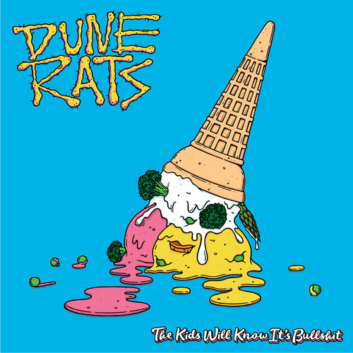
You might not recognise Forster artist Lee McConnell by name, but chances are you’ll recognise some of his work. He’s designed album covers, posters, and videos for some of our favourite Aussie acts and festivals such as; Dune Rats, Grinspoon, DZ Deathrays, Grown Your Own, Peking Duck, Jack River, and more.
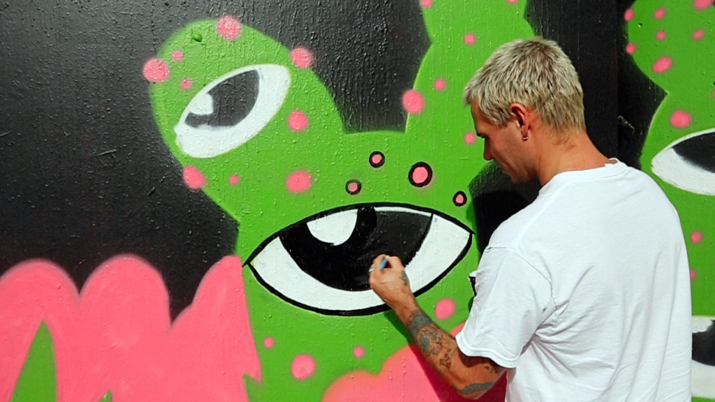
Stylistically McConnell incorporates bright colours, mind-melding abstract imagery, and warped features of the natural world in a way that feels both environmentally-anchored and interdimensional at the same time. It’s weird but also euphoric, which is why he’s the perfect person to be the Splendour In The Grass artist in residence and have his work gazed upon by the thousands of attendees.
In conjunction with Splendour, he’ll also be having an exhibition of his own titled ‘Hypnagogic Tableau’ at Lone Goat Gallery in Byron from July 12th to August 6th (info here), which we thoroughly recommend you get yourself to. But, before you catch him at Splendour and in Byron, get to know him a little better below:
Before you became a full-time artist, you were working in a Chinese restaurant, and you’ve since gone on to forge an incredible career. If a successful artist was a spring roll, what would be the key four or five ingredients?
Heaps of MSG to keep you up for many tireless nights, lots of food colouring, salt, cabbage, and a few ideas. Wrap it in a canvas, turn the gas on high and fry it for a while.
What artists did you draw influence from when you were starting out? Is there any current artist you’re really vibing on at the moment?
I drew lots of influence from Reg Mombassa for his dry humour, subject as well as his style. Jeff Raglus is another one of my favourite artists and his style got me at a young age after my parents gifted me the kids book Jeff wrote and illustrated called Schorky The Wave Puncher.
I remember being in awe of the funky little town he created through his paintings on each page. His textures and colour use really drew me in. I guess both those artists at the time were creating very relatable Australian scenes. It’s sort of something that features in my work to some extent still these days. I’ve bought a lot of paintings from Jeff and even commissioned him to paint the first house I grew up in.
Ozzie, Ben Brown among others a bit later on through school and recently I’ve been really into Andrew Fairclough’s work. I first saw his stuff at an exhibition at China Heights in Sydney. He had all these painted and screen printed works combined of muted pinks and purples. I bought one of these 60’s sci-fi style girl as a floating head and her eyes are coming out from her face with a galaxy inside her head. It’s super cool and the colours instantly got me. I also love Joan Cornella too.
You’ve designed posters and album art for some of Australia’s most beloved groups, especially punk acts, but what sort of music do you listen to when creating?
Lots of different music, it all depends on my mood or what I’m feeling that day. Maybe if I’m working for a certain band, I’ll listen to them.
Who would be your dream act (past or present) to design for?
Bowie would of been unreal! I’m a big fan of Tame so I’d be down to work with Kevin Parker on a vision. Mac Demarco would be cool too based on his latest videos…
A lot of your work juxtaposes grim imagery (eyeballs, brains, etc) with super bright colours. Why does this style appeal to you?
Umm I guess when I do work with ‘grim imagery’ it is for that exact reason. I like to see the juxtaposition between both and it’s fun to do. I love working with bright colours and the marriage between certain colours can make any subject or situation happy and nice to look at.
I do tend to have a lot of eyes in my work and that comes from experiences in understanding there is more than the surface we see. Everything has a personality if you look deeper.
‘Hypnagogic Tableau’ is an interesting title for your upcoming show, can you tell us a bit about what that title means to you?
Well firstly, the title sums up for me where my imagination can take me, especially when I’m falling asleep and having very vivid visions or lucid dreaming. It’s about a space where you can control and run wild with your imagination. ‘Hypnagogic’ is that window between consciousness and sleep, a word I came across a few years ago that I thought sounded cool.
‘Tableau’ came after I threw the word ‘Scene’ and ‘portrayal’ into the thesaurus and when combined with Hypnagogic it sounded French and funny. I have been enjoying saying in accent over and over. Sounds really fancy for my first solo show.
What are you looking forward to most about Splendour?
Pretty psyched to see the artwork I’ve done in the flesh and on a big scale. It’s a very special thing to me. Also it’s a good catch up and always a good time. I’m keen to see Tame’s set too.
Are you going to be able to find some time to watch bands? Or is it work, work, work?
Nah, most of my work is done prior so I’ll be out there enjoying it for sure!
Can you give us any insight as to what sort of visual treats you have in store for us at SITG?
I’ve painted a big mural on the tunnel as you are entering the fezzy. It’ll be staring right at ya.